Best Practices for Designing Storefront Ads
Peering through a high-traffic street, you might wonder what separates one buzzing business from the sleepy one next door. More often than not, it’s those who wield the magic wand of storefront advertising with a dash of wit and some visual flair. A storefront isn’t just four walls and glass; it’s a stage, and your ad is the lead actor spotlight nervousness and all.
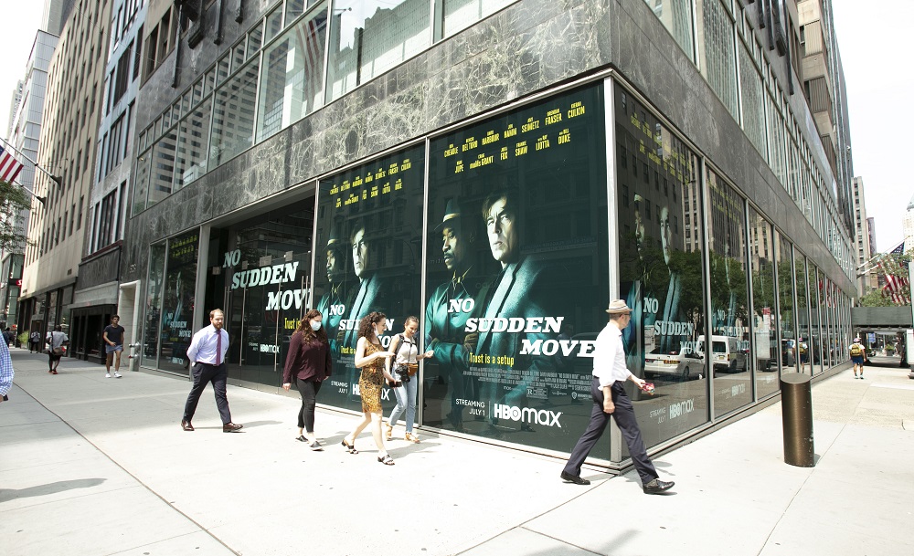
Let’s talk turkey. Bad signage gets skipped. Great storefront ads? They stop people faster than free Wi-Fi at a coffee shop. But don’t kid yourself good design is harder than it looks, and it’s easy to miss the mark if you just throw letters at the window and hope for the best.
Focus Like a Hawk: Clarity Trumps Cleverness
Don’t be seduced by the siren song of clever wordplay if it muddles your message. Clear, simple language always wins. If a hurried shopper can’t tell what you offer or why they should care in five seconds or less, your sign might as well be invisible.
Big, bold fonts are your friends. You want a sixth-grader to read your sign while sprinting for the bus (preferably not into traffic). Avoid hard-to-read scripts, microscopic letters, or color combinations that disappear in bright sunlight. Contrast is king: black on yellow, white on navy, and red on white all work like a charm.
Keep your core message front and center. A bakery’s window that simply says, “Warm Bread, Fresh Daily” is far more effective than a tiny, poetic essay about sourdough ascension.
Picture This: Use Imagery That Pops
You don’t need to rival the Louvre, but a striking image can make your ad leap out at passersby. Show your product doing its thing. For a café, a steaming mug practically invites folks to inhale the aroma. Grocers, barbershops, even hardware stores visuals create instant context.
High-resolution photos go a long way.
Grainy or outdated images say “we don’t care,” and that’s not a sentiment you want in your window. Consider props, 3D displays, or even quirky mannequins to bring personality and intrigue to the presentation.
Color: More Than Just Paint
Colors call the shots. Studies say red triggers appetite used wisely, it can drive a pizza shop’s business (and perhaps some waistlines). Blue feels calm and trustworthy, perfect for a pharmacy or bookstore. Neon greens scream “look at me!” helpful for a pop-up costume shop, maybe less so for grandma’s antique teacup emporium.
Use color strategically, but don’t start a war on the eyes. Too many hues and your display turns into a Jackson Pollock painting lots of action, zero clarity. Stick with two or three harmonizing colors, then let your central message stand out.
Space: Less Is Usually More
White space isn’t wasted space. It’s breathing room for the eyes. Packing your storefront ad with every product, offer, and emoji you can dream up creates a jumble that people simply ignore. Ever seen those “clearance” windows so cluttered, you can’t tell if there’s an actual exit behind all the stickers?
Instead, edit ruthlessly. Feature your best offer, season’s must-have, or just one fun call-to-action. Too much noise, and you lose your audience before they even crack a smile.
Lighting: Showtime, All the Time
Night falls early half the year, but your ad doesn’t have to clock out. Good lighting transforms a dark window into a glowing beacon. LED strips, spotlights, fairy lights pick your flavor, but prioritize visibility after sundown.
If you’re displaying photos or products, check for glare and reflections that sabotage your efforts. Natural light is fantastic if it doesn’t wash out your graphics, so test at different times of day. A few well-placed spotlights can highlight your hero product and keep your ad shining bright.
Local Flavor and Seasonal Updates
Communicate like a neighbor, not a faceless corporation. Tying your ad to local events, holidays, or inside jokes makes your business approachable. “Hot cocoa for parade day” or “Beat the summer heat with homemade lemonade!” tells your community you’re part of its story.
Don’t let your displays gather dust. People stop noticing even the most gorgeous graphics after a few weeks. Change things up every month, or even for the seasons a rotating window theme builds anticipation and keeps regulars peeking in.
Craft an Invitation, Not Just an Announcement
The ultimate goal with storefront advertising? Move people from “that’s nice” to “I have to see more.” The best ads create a sense of urgency or curiosity. “Today Only, Free Cookie Samples!” or “Guess how many marbles in the jar—win a prize!” Simple prompts get people to pause, peek inside, and maybe, just maybe, become your next regular.
If you treat your storefront as a living advertisement one that speaks, teases, and welcomes you’ll win over your street, one window shopper at a time.