A well-designed flyer remains one of the most effective tools for promoting a new product or announcing a special offer. Even in the age of digital marketing, businesses continue to rely on flyers because they deliver clear information quickly and create a direct visual impact. When thoughtfully designed, a flyer can capture attention, communicate a brand message, and motivate potential customers to learn more about a product or promotion. For companies planning a launch or campaign, exploring creative flyer design ideas can make a significant difference in the success of the promotion.
The first important concept in flyer design is clarity of purpose. A flyer created for a product launch must immediately communicate its main message. Readers should understand the purpose of the flyer within seconds of seeing it. This means the headline, visuals, and layout should work together to guide the viewer’s attention. The headline typically occupies the most prominent position and delivers the central message of the promotion. A strong headline combined with concise supporting text ensures that the flyer communicates value without overwhelming the reader.
Visual hierarchy plays a crucial role in effective flyer design. When someone picks up a flyer, their eyes naturally move across the page searching for key information. Designers can guide this movement by arranging elements in a logical order. The most important details such as the product name, launch announcement, or promotional message should appear first, followed by supporting details and a clear call to action. This structured arrangement helps the flyer communicate information efficiently while maintaining visual balance.
Color selection is another essential factor when designing a promotional flyer. Colors influence emotions and help establish brand identity. A carefully selected color palette creates consistency with the company’s overall branding while ensuring the flyer remains visually appealing. Bright or contrasting colors can draw attention to important elements such as headlines or promotional offers. At the same time, balanced color combinations ensure that the flyer remains professional and easy to read.
Typography also has a strong influence on how a flyer communicates its message. The choice of fonts should align with the brand’s personality while remaining clear and readable. Using a limited number of fonts helps maintain visual harmony. Typically, one font style can be used for headlines while another is used for body text. Proper spacing between lines and letters improves readability and ensures the flyer looks polished. Consistent typography reinforces brand identity and creates a sense of professionalism.
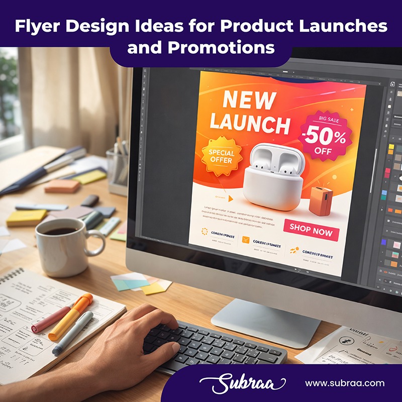
Images and graphics can significantly enhance the appeal of a flyer. Visual elements capture attention quickly and help convey information without relying solely on text. High-quality images related to the product or brand can make the flyer more engaging and memorable. Graphics such as icons, patterns, or shapes can also help structure the layout and highlight key information. When used thoughtfully, these elements guide the reader through the flyer while reinforcing the promotional message.
White space is often overlooked but plays an important role in flyer design. A crowded flyer filled with too much text and imagery can confuse readers and reduce the effectiveness of the message. White space allows design elements to breathe and helps guide the reader’s focus to important sections. By creating space between headings, images, and paragraphs, designers can ensure that the flyer remains clean, organized, and visually appealing.
Another important idea is maintaining consistency with the brand identity. A flyer should reflect the brand’s visual style so that customers immediately recognize the company behind the promotion. This includes using the same color palette, fonts, and design elements that appear in other marketing materials. Consistency builds trust and strengthens brand recognition. When a flyer matches the overall brand identity, it becomes part of a cohesive marketing strategy rather than a standalone advertisement.
A strong call to action is essential for any promotional flyer. The call to action tells readers what they should do after reading the flyer. It might encourage them to visit a store, explore a website, or learn more about the newly launched product. The call to action should be clearly visible and placed in a prominent position within the layout. Using bold text, contrasting colors, or design frames can help emphasize this section of the flyer and encourage readers to respond.
Layout design also influences how effectively a flyer communicates its message. Grid-based layouts help organize content and create a sense of structure. By dividing the flyer into sections, designers can present information in a clear and logical way. Balanced layouts prevent visual clutter and ensure that the flyer remains easy to read. A well-structured layout allows each element to support the overall message rather than competing for attention.
Digital integration is another modern consideration for flyer design. Many promotional flyers now connect physical marketing with online engagement. Including scannable codes or digital links encourages readers to interact with the brand beyond the printed material. This approach expands the reach of a flyer and allows businesses to track engagement with their campaigns. When combined with compelling design, digital integration makes the flyer a gateway to a broader marketing experience.
Paper quality and printing techniques also affect the perception of a flyer. A well-printed flyer with high-quality materials can create a strong impression and reflect the value of the product being promoted. Matte finishes, textured paper, or other print treatments can enhance the visual and tactile experience. When the physical flyer feels premium, it reinforces the credibility of the brand and the importance of the product launch.
Strategic distribution is just as important as design. Even the most visually appealing flyer will not achieve results if it does not reach the right audience. Businesses should consider where their target customers are most likely to encounter the flyer and plan distribution accordingly. When the flyer reaches the appropriate audience, its design and message can achieve their full promotional potential.
Another useful idea is to focus on storytelling through design. A flyer does not need to rely solely on text to communicate a message. Through layout, visuals, and typography, designers can guide readers through a narrative that highlights the excitement of a product launch or promotional campaign. This visual storytelling approach creates emotional engagement and makes the flyer more memorable.
Ultimately, the success of a flyer depends on how well it combines creativity with clarity. Effective flyer design captures attention, communicates essential information quickly, and encourages action. By focusing on visual hierarchy, color harmony, typography, layout structure, and brand consistency, businesses can create a flyer that stands out in competitive promotional environments. When thoughtfully crafted, a flyer becomes more than just a piece of printed material. It becomes a powerful marketing tool that introduces new products, communicates brand identity, and inspires customers to engage with the promotion.
Visit us : https://www.subraa.com/