Data analysis has become an indispensable part of decision-making in today's fast-paced world. Whether you're a business analyst, a financial expert, or a project manager, you rely on data to make informed choices. Excel, the beloved spreadsheet software, is often the go-to tool for managing data. Excel has powerful tools for data analysis and visualisation, including Pivot Tables and Pivot Charts. In this blog, we'll explore these tools. These dynamic duo features can help you unlock the true potential of your data, allowing you to extract meaningful insights and make data-driven decisions. Let's get started!
Table of Contents
- The Power of Pivot Tables
- Enhancing Analysis with Pivot Charts
- Combining Pivot Tables and Pivot Charts for Comprehensive Analysis
- Conclusion
The Power of Pivot Tables
Before we delve into the magic of Pivot Charts, let's take a moment to appreciate the power of Pivot Tables. These dynamic tables allow you to summarise, analyse, and manipulate large datasets with ease. Here's how you can create one:
- Data Preparation: First, ensure that your data is organised in columns with clear headings. Each column should represent a specific attribute or variable.
- Select Your Data: Highlight the range of data you want to analyse, including the headers.
- Insert Pivot Table: Go to the "Insert" tab in Excel and select "PivotTable." A dialogue box will appear, allowing you to select the data range you want.
- Design Your Pivot Table: Drag and drop the relevant fields into the "Rows," "Columns," and "Values" areas of the PivotTable Fields list. Excel will instantly generate a table that summarises your data based on your selections.
Here's where the magic happens! Pivot Tables allow you to:
- Summarise Data: Quickly summarise large datasets by calculating totals, averages, counts, and more.
- Filter Data: Easily filter your data to focus on specific categories, periods, or values.
- Create Hierarchies: Drill down into your data by creating hierarchies of fields, providing a deeper level of analysis.
- Generate Calculations: Add custom calculations to your Pivot Table to derive insights that standard summaries can't provide.
Now that we've covered the basics of Pivot Tables let's take our analysis to the next level with Pivot Chart Excel.
Enhancing Analysis with Pivot Charts
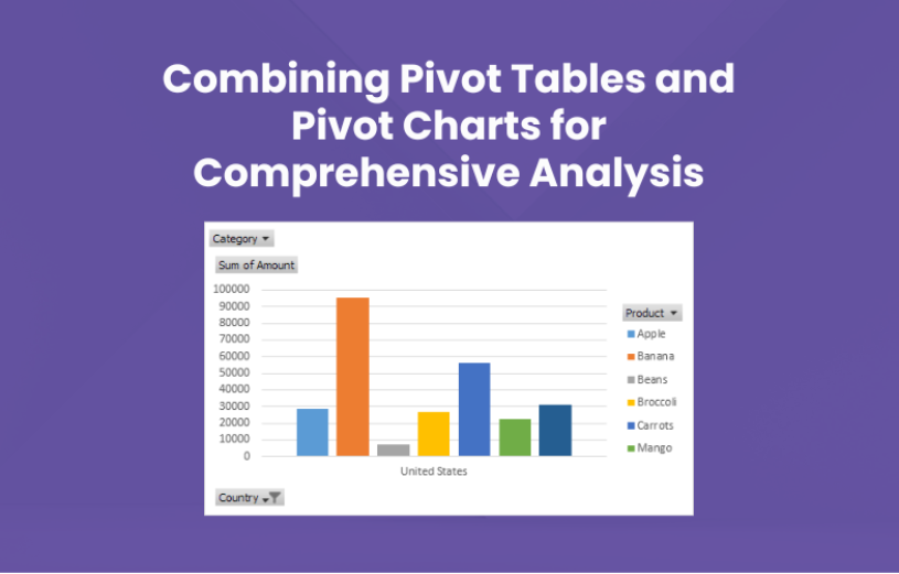
Pivot Charts are dynamic visual representations of your Pivot Table data. They allow you to see trends, patterns, and outliers at a glance. To create a Pivot Chart, you'll need to have a Pivot Table first. Here's how to do it:
- Create a Pivot Table: Follow the steps mentioned above to create a Pivot Table.
- Highlight the Pivot Table: Click anywhere inside your Pivot Table to select it.
- Insert Pivot Chart: Go to the "Insert" tab and choose "PivotChart." Excel will display a gallery of chart types for you to choose from.
- Select Your Chart Type: Pick the chart type that suits your data and analysis goals. You can choose from bar charts, line charts, pie charts, and more.
- Design Your Pivot Chart: Customise your Pivot Chart by dragging and dropping fields from the PivotTable Fields list to the various areas of the chart, such as "Axis," "Legend," or "Values."
Pivot Charts are not just visually appealing; they offer several advantages for comprehensive data analysis:
- Real-time Updates: Any changes you make to the underlying Pivot Table are instantly reflected in the Pivot Chart. This ensures your visualisations are always up-to-date.
- Interactivity: Pivot Charts allow you to interact with your data. You can click on data points to drill down for more information or filter the chart to focus on specific elements.
- Easy Comparison: Use Pivot Charts to compare data across different categories or periods. This makes it easier to identify trends and anomalies.
- Visualise Complex Data: Pivot Charts can handle complex datasets with multiple dimensions, making it easier to understand the relationships between variables.
Now that you understand the power of Pivot Tables and Pivot Charts independently let's see how combining them can elevate your data analysis.
Combining Pivot Tables and Pivot Charts for Comprehensive Analysis
Imagine you're a sales manager trying to analyse your team's performance over the past year. You have a spreadsheet with thousands of sales transactions, including the date, salesperson's name, product sold, and revenue generated. Using Pivot Tables and Pivot Charts together, you can gain deep insights into your team's performance.
- Pivot Table Analysis: Start by creating a Pivot Table to summarise the data. You could have rows for each salesperson, columns for each month, and values representing the total revenue for each combination.
- Pivot Chart Visualisation: Once your Pivot Table is ready, insert a Pivot Chart that corresponds to your analysis. For this scenario, a line chart showing monthly sales trends would be ideal.
- Interactivity: With your Pivot Chart in place, you can now interact with it. Click on a salesperson's name in the chart legend to isolate their performance. Hover over a point on the line chart to see the exact revenue for that month.
- Comparative Analysis: You can easily compare the performance of different salespeople by selecting or deselecting them in the chart legend. This helps you identify top performers and areas where improvement is needed.
- Filtering and Slicing: Use Pivot Tables and Pivot Charts in tandem to filter data. For instance, you can select a specific time frame in the Pivot Table, and the Pivot Chart will instantly update to show only that period's data.
With Pivot Tables and Pivot Charts, you can analyse your sales team's performance, identify trends, and make data-driven decisions to improve results.
Conclusion
Excel's Pivot Tables and Pivot Charts are invaluable tools for data analysis and visualisation. When used in combination, they become a dynamic duo that empowers you to unlock the full potential of your data. Whether you're a business analyst, a financial expert, or just someone looking to make sense of your data, mastering Pivot Tables and Pivot Charts will take your skills to the next level.
So, the next time you're faced with a mountain of data that needs analysing, remember the power of Pivot Tables and Pivot Charts. They will not only save you time but also provide you with deeper insights and a clearer understanding of your data.