Discover why clear UX, messaging, and conversion-focused strategy at Hyperiux outperform clever design in driving conversions, trust, and better digital experiences.
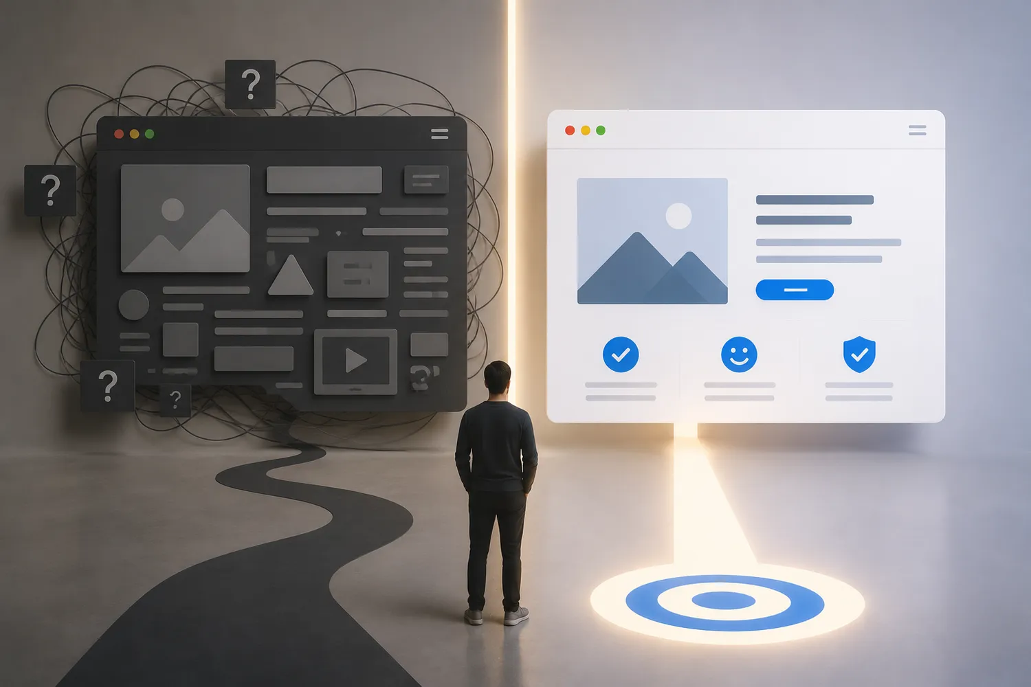
Most underperforming websites are not ugly. They are unclear. The homepage looks modern. The animations are polished. The copy sounds intelligent. Yet conversions stall because users cannot quickly understand what the company does, why it matters, or what action to take next.
That is the hidden cost of prioritizing cleverness over comprehension. In high-performing websites, clarity is not a stylistic preference. It is a conversion mechanism. The faster users understand value, the faster they move toward trust, engagement, and action. This is especially true in SaaS, fintech, and B2B environments where buyers evaluate risk before they evaluate features.
A clever headline may impress a marketing team. A clear headline books demos.
This article explains why clarity vs cleverness in web design directly affects conversions, trust, CAC efficiency, and enterprise buying behavior, and how businesses can build digital experiences optimized for comprehension instead of decoration.
Key Takeaways
- Clever messaging often increases cognitive load and reduces conversions.
- Users scan websites for clarity, not creativity
- High-performing websites optimize for comprehension speed.
- Clear UX improves trust, onboarding completion, and demo bookings.
- Enterprise buyers prefer predictability over novelty during evaluation.
- Strong websites reduce decision friction through messaging hierarchy and guided UX systems.
The Hidden Cost of Clever Websites
Many companies mistake originality for effectiveness. The result is a website that sounds impressive internally but creates friction externally.
Visitors encounter abstract headlines, vague positioning, unconventional navigation, or overly stylized interfaces that require interpretation before comprehension. Every additional second spent decoding the experience weakens momentum. That matters because users rarely arrive patient. They arrive skeptical.
Confusion Is a Conversion Tax
When users cannot immediately answer basic questions, conversion performance declines:
- What does this company do?
- Is this relevant to me?
- Why should I trust it?
- What should I do next?
Clever websites delay those answers. High-performing websites accelerate them. This distinction becomes critical in B2B and SaaS buying environments where users are already evaluating operational credibility. Ambiguous messaging increases perceived risk. Clear messaging reduces it.
A surprising number of “traffic quality” problems are actually clarity problems. The traffic may be correct. The comprehension path is not.
Enterprise Buyers Do Not Reward Ambiguity
Enterprise users are not browsing for entertainment. They are assessing competence. A homepage that prioritizes clever wordplay over immediate value communication forces buyers to work harder than necessary. And users interpret unnecessary effort as operational inefficiency. That perception quietly damages:
- Demo conversion rates
- Sales velocity
- Trust formation
- Product understanding
- Stakeholder alignment
If your website attracts traffic but struggles to convert qualified leads, a Website Clarity Audit at Hyperiux often reveals where comprehension breaks down first.
Users Don’t Read Websites, They Decode Them
Most visitors do not consume websites linearly. They scan. They jump between headlines, navigation elements, visuals, CTAs, pricing cues, and trust signals looking for confirmation that they are in the right place. This scanning behavior changes how websites should be designed.
Users are not trying to admire your interface. They are trying to reduce uncertainty. That means comprehension speed matters more than creative expression during key conversion moments.
Clarity Reduces Cognitive Load
Cognitive load refers to the mental effort required to process information. Every unclear headline, inconsistent layout, hidden navigation pattern, or abstract CTA increases that effort. High cognitive load creates friction because users must spend energy interpreting instead of progressing.
The strongest websites reduce interpretation work. They guide users toward certainty quickly and predictably.
Clarity Creates Momentum
Momentum matters in digital experiences.Users continue exploring when they feel oriented. They leave when interaction costs outweigh perceived value. Clear UX maintains momentum through:
- Obvious information hierarchy
- Predictable navigation
- Clear messaging structure
- Transparent next steps
- Readable layouts
- Strong CTA framing
This is why many high-converting SaaS websites appear simpler than competitors. They are optimized for speed of understanding. Not visual novelty.
Why Clarity Increases Conversion Rates
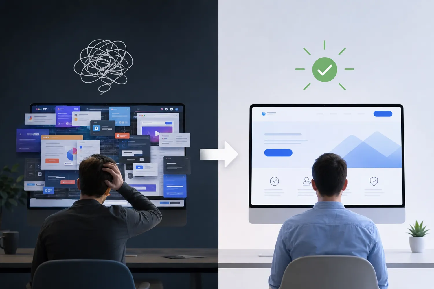
Conversions improve when users understand value faster. That sounds obvious. Yet many websites unintentionally slow comprehension through messaging complexity, visual excess, or unnecessary experimentation.
The Hyperiux Clarity Ladder™
At Hyperiux, we approach conversion clarity through a five-stage framework designed to reduce friction and improve decision confidence.
1. Instant Recognition
Users should immediately recognize:
- What the company offers
- Who it serves
- Why it matters
This happens within seconds. If users need to “figure it out,” the website is already underperforming.
2. Value Comprehension
Clear websites explain outcomes, not abstractions. Weak messaging often describes ambition:
“Transforming digital synergy through intelligent experiences.” Strong messaging explains value:
“Reduce onboarding friction and increase SaaS conversion rates.” One sounds clever. The other sounds useful.
3. Risk Reduction
Users look for signals that reduce uncertainty. Examples include:
- Clear pricing
- Predictable navigation
- Client logos
- Security indicators
- Product screenshots
- Transparent onboarding expectations
Trust increases when users feel informed.
4. Decision Guidance
Strong UX removes ambiguity around next steps. Users should never wonder:
- Which action matters most
- Where to click next
- What happens after conversion
- How long a process takes
High-performing websites guide action intentionally.
5. Conversion Momentum
Momentum compounds when users experience low-friction progression across the journey. Clear interactions create psychological confidence. Confidence increases action-taking. That is why clarity improves:
- Demo bookings
- Trial activation
- Form completion
- Onboarding progression
- Enterprise engagement
The Most Common “Cleverness” Mistakes in Modern Web Design

Most clarity failures are not dramatic. They are subtle accumulations of friction.
Vague Headlines
Headlines trying too hard to sound unique often fail to communicate actual value. Users should understand relevance immediately. Clarity beats intrigue in conversion-focused environments.
Abstract Messaging
Abstract copy forces interpretation. B2B buyers prefer specificity because specificity reduces perceived risk. If messaging cannot be understood quickly, trust formation slows down.
Overdesigned Interfaces
Animation-heavy layouts, excessive transitions, and visually dense interfaces often reduce usability. Design should support comprehension. Not compete with it.
Hidden Navigation
Creative navigation patterns may appear innovative but frequently reduce orientation. Predictability is underrated in UX. Especially for enterprise users evaluating reliability.
Ambiguous CTAs
Buttons like “Explore Possibilities” or “See the Future” may sound imaginative. They also reduce action clarity. Users respond better when CTAs explain outcomes directly:
- Book a Demo
- Start Free Trial
- View Pricing
- Schedule Consultation
Specificity improves confidence.
What High-Performing Websites Actually Optimize For

Top-performing websites do not optimize primarily for aesthetics. They optimize for decision-making efficiency.
Great UX Feels Obvious
Users should never feel like they are solving a puzzle. Strong digital experiences feel intuitive because they minimize uncertainty at every stage. High-performing websites consistently prioritize Message clarity, Predictable UX, Information hierarchy, Readability, Clear CTAs, Structured onboarding
Trust signalsThis is important for SaaS and fintech companies where users evaluate both functionality and operational maturity simultaneously.
Contrarian Perspective
“Creative” websites often perform worse than simpler competitors because users prioritize certainty over originality during decision-making. That does not mean websites should feel generic. It means creativity should support comprehension instead of obstructing it. That distinction separates award-winning interfaces from revenue-generating ones.
Before vs After: Simplifying UX for Better Performance
Consider an illustrative SaaS homepage redesign focused primarily on clarity improvements.
Before
The original experience included:
- Abstract positioning language
- Minimal product explanation
- Overly animated interface sections
- Weak CTA hierarchy
- Dense navigation structure
Results included:
- High bounce rates
- Weak demo engagement
- Low homepage scroll depth
- Confused sales conversations
After
The redesigned experience prioritized:
- Clear value proposition hierarchy
- Simplified navigation
- Outcome-focused messaging
- Structured CTA placement
- Predictable content flow
Example:
Post-redesign outcomes included:
- Increased demo bookings
- Better CTA engagement
- Lower bounce rates
- Faster sales qualification conversations
The visual redesign itself was not radical. The clarity improvements were. That is often where the highest conversion gains come from.
Website Clarity Checklist
Businesses trying to improve website conversion clarity should audit these areas first:
Quick Clarity Audit
- Can users understand your value proposition within five seconds?
- Are headlines specific instead of abstract?
- Is navigation predictable?
- Do CTAs explain outcomes clearly?
- Is messaging structured hierarchically?
- Are trust signals visible near conversion points?
- Does the interface reduce cognitive effort?
- Is mobile readability optimized?
- Are onboarding expectations transparent?
- Does the site guide users toward one primary action?
A website should not make users feel intelligent for understanding it. It should make understanding effortless.
Checkout the Homepage Clarity Scorecard for SaaS Teams at Hyperiux to identify friction points reducing comprehension and conversions.
When Businesses Should Audit Website Clarity

Most clarity problems become visible only after performance declines. By then, acquisition inefficiencies are already expensive. Businesses should audit website clarity when:
- Traffic increases but conversions stagnate
- Users bounce quickly from key pages
- Sales teams repeatedly explain basic positioning
- Demo quality declines
- Enterprise buyers seem hesitant
- Product messaging becomes increasingly complex
- Website redesigns improve aesthetics but not outcomes
Fear of Inaction
If users consistently struggle to understand your website, competitors with clearer positioning will win trust faster, even with comparable products. That advantage compounds through every acquisition channel.
Conclusion
High-performing websites do not succeed because they sound smarter. They succeed because users understand them faster.
Clarity reduces cognitive effort, accelerates trust formation, improves conversion momentum, and creates more predictable buying experiences across SaaS, fintech, and B2B environments. The strongest digital experiences prioritize comprehension over decoration. Because users rarely reward complexity during decision-making. They reward certainty. And certainty converts.
Book a Website Clarity Audit at Hyperiux to uncover the friction reducing comprehension, trust, and conversions.
FAQs
Why is clarity important in web design?
Clarity is important in web design because users make fast decisions based on comprehension and trust. Clear messaging, predictable navigation, and structured UX help visitors understand value quickly, reducing cognitive load and improving conversion rates. When users feel oriented and informed, they are more likely to engage and take action.
Can clever copy reduce conversions?
Yes. Clever copy can reduce conversions when it prioritizes creativity over comprehension. Abstract headlines, vague messaging, and overly stylized language often force users to interpret meaning instead of understanding value immediately. In conversion-focused environments, clarity generally outperforms originality because users prioritize certainty and relevance.
What makes a website easier to understand?
Websites become easier to understand through clear messaging hierarchy, intuitive navigation, readable layouts, predictable UX patterns, and specific CTAs. Strong information architecture reduces cognitive effort and helps users identify relevant actions quickly. Simplicity alone is not enough — structure and clarity matter more.
How does UX clarity impact trust?
UX clarity impacts trust by reducing uncertainty during digital interactions. Users feel more confident when interfaces behave predictably, messaging is transparent, and workflows are easy to follow. Confusing UX increases perceived risk, while clear experiences signal operational competence and improve buyer confidence.
About the Author
Bhaskar Varshney is the Founder & CEO of Hyperiux, formerly Enigma Digital. He is a behaviour-driven design and digital experience strategist with over 15 years of experience across UI/UX, digital marketing, consumer psychology, client consulting, and conversion-focused digital experiences. Through Hyperiux, he helps ambitious brands build frictionless websites, products, and interactive digital experiences that resonate with users and drive business outcomes.