1. Analyzing samples of data frames with df.groupby().__iter__()
It’s usually hard to explore a dataset row by row or group by group within a Jupyter Notebook compared to what you can do with Excel. One useful trick is to use a generator and use Ctrl + Enter instead of Shift + Enter in order to iteratively look at different samples within the same cell, without creating a mess in your notebook.
If you want to Gain In-depth Knowledge on Data Science, please go through this link Data Science Course
First create a cell with the generator with .groupby() (or .iterrows()) and add the .__iter__():
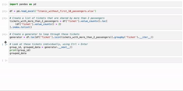
Then, run the following cell as many times as you wish to observe the data that matters most to you, using the keyboard shortcut Ctrl + Enter:
Here’s an example analysing passengers within the Titanic dataset that share the exact same Ticket number. You don’t have the ability to isolate each group of passengers individually, so using this method lets you analyse one group after the other in a very simple way:
2. Pandas Profiling for data exploration and data quality assessment
As often in data science, we tend to write from scratch our data exploratory code. Since all datasets are different, it makes sense. However, there’s the magical pandas_profiling package that makes this reasoning pointless. The package actually automates the data exploration and data quality assessment steps! Take a look
Obviously it doesn’t solve all data exploration, for instance if you’ve got free text variables in your data. But it should be the way you start analysing any dataset.
3. Multi chaining
Pandas becomes really fun once you understand that you can combine multiple operations using the chaining method. Chaining is basically adding operations within the same ‘line’ of code.
With the line of code below, I am
- adding a new column in my dataset (.merge)
- counting the proportion of female passengers (.apply(female_proportion))
- for groups of more than 1 passengers (df.Ticket.value_counts()>1)
- having the same ticket number (.groupby(‘Ticket’)).
And I didn’t have to create new dataframes, new variables, new anything. The chaining method allows you to ‘translate’ your thoughts into actual operations.
The example below is also a good example of the chain method:
4. Plotting coefficients / Feature Importance with style
If you’re doing Machine Learning, you know the struggle to explain clearly your Machine Learning model in layman’s terms. One way to help here is to have a good visual of the coefficients or the variable importances within your model.
Take your career to new heights of success with an Data Science Online Training
I’ve gathered code from multiple sources to get the following visualisation that I re-use all the time (and avoid reinventing the wheel):
Which gives the following output:
Pretty neat right?
5. sklearn_pandas
If you’re a pandas advocate, you have come to realise more than once that working with pandas DataFrame and sklearn isn’t always the best fit. But don’t stop here. A handful of motivated contributors have created sklearn_pandas, the bridge between the two packages. It replaces sklearn’s ColumnTransformer with a pandas-friendly DataFrameMapper. I’ve started using only sklearn_pandas these days and I’m not disappointed. I wish I had known this before.
6. tqdm
When dealing with large datasets, data manipulation will take time. Instead of waiting with a dull face in front of your Jupyter Notebook without knowing what’s happening, use tqdm to track whether your code is actually running and how long it takes. It’s also a good way to abort early on a script that is too slow to run.
Now all pandas DataFrame have new methods:
- .progress_apply, .progress_applymap
- .progress_map for columns ’re the same as apply, applymap and map with the difference that they’ll plot a progress bar. How useful!
7. the .to_clipboard() to paste in Excel
As a fervent Excel user, I’ve developed skills to do sexy plots and nice formatting to show insights from data. Even though pandas has many options, it can be hard to get the similar level of output with minimal coding.
One thing that I ended up doing a lot to cope with that is to export my results to Excel. But not using the .to_excel method. Instead, I use the smoother .to_clipboard(index=False) that copies data to the clipboard. I then use Ctrl + V in Excel to paste the data in my current spreadsheet. And here you go, you may unleash the Excel beast that’s inside you.
One thing that a lot of data scientists tend to forget is that non data scientists are generally skilled in Excel. It’s easier to share an Excel file with them rather than a Notebook or a Notebook exported as an html file.