Data visualization has long been a method of effective communication and decision-making. Charts and graphs have traditionally served as the go-to tools for representing data in an understandable manner. However, as the world becomes increasingly data-driven, the need for more innovative and sophisticated data representation approaches has emerged. Here, we will take a deeper look into the world of data visualization, exploring innovative strategies that harness modern technology and design to convey information in new and exciting ways.
The Evolution of Data Visualization
It is safe to say that data visualization is as old as human civilization itself. From cave paintings illustrating hunting scenes to the earliest maps, humans have always desired to represent complex information visually. Fast forward to the digital age, and data representation has taken on a whole new dimension. With the development of powerful computers and software, we can now create intricate, interactive visualizations that go far beyond the limitations of traditional charts and graphs.
Innovative Approaches to Data Visualization
Interactive Dashboards
Interactive dashboards are powerful tools in the world of data visualization, offering a user-friendly way to represent complex datasets. These digital interfaces allow users to explore data in real time, providing the flexibility to adjust filters, select specific dimensions, and go down into details with just a few clicks. By utilizing the capabilities of modern software and technology, interactive dashboards enable users to transform raw data into meaningful insights.
Whether it's tracking key performance indicators in a business setting, monitoring patient data in healthcare, or analyzing user behavior in a digital platform, interactive dashboards provide a visually intuitive way to present data.
3D and Augmented Reality
3D augmented reality is a technology that combines elements of the physical and digital worlds by overlaying three-dimensional virtual objects or information onto the real-world environment. Unlike traditional two-dimensional images or videos, 3D AR provides users with a more immersive experience, where digital content appears to coexist with the physical surroundings through the use of devices like smartphones, tablets, or augmented reality glasses.
3D AR has numerous applications. For example, architects and city planners can use AR to visualize building designs and infrastructure projects in their real-world context. In healthcare, 3D AR can be employed to visualize complex medical data, such as MRI scans and 3D reconstructions of anatomical structures.
Heatmaps and Choropleth Maps
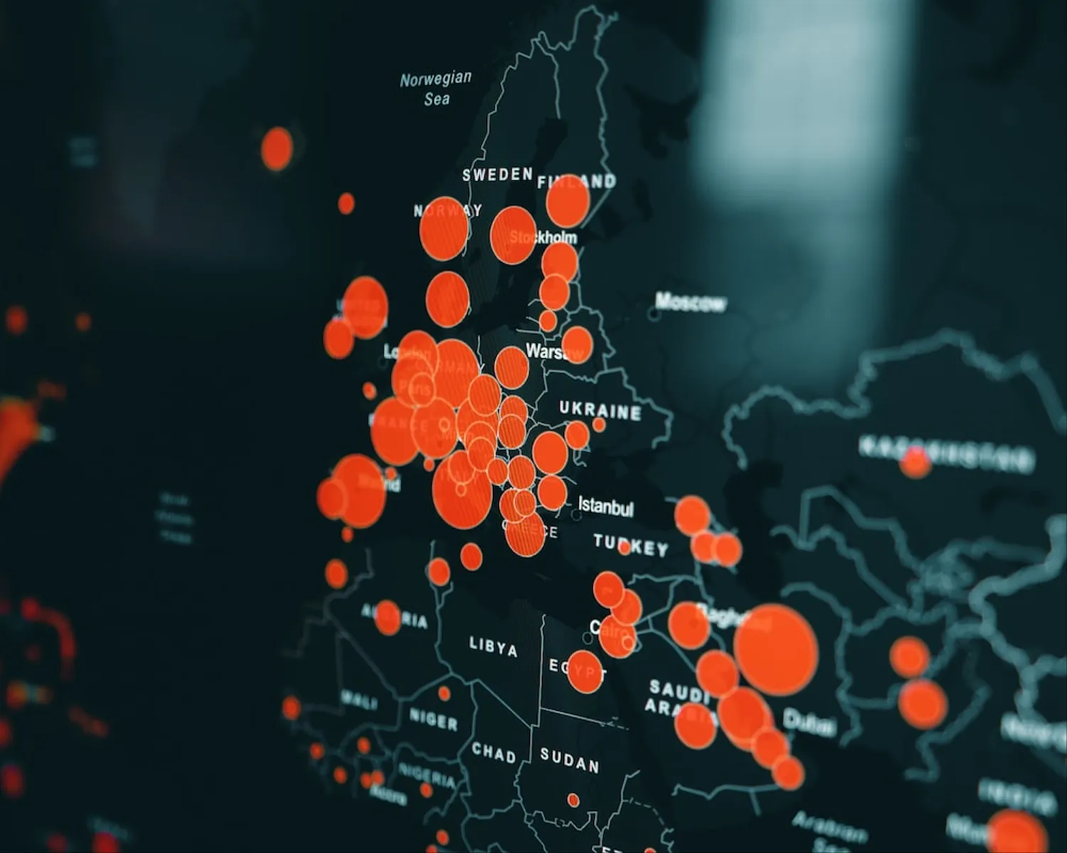
Heatmaps and choropleth maps use color intensity for data representation across geographic regions or a grid. In a heatmap, each grid or geographical region is assigned a color gradient that corresponds to a particular data attribute, such as temperature, population density, or website traffic. The color scale usually ranges from cool colors to warm colors, with variations in color intensity representing variations in the data. Heatmaps effectively highlight trends and patterns within the data, making them valuable tools in fields such as business analytics and epidemiology.
Choropleth maps, on the other hand, represent data by shading or coloring different geographical areas, such as countries, states, or regions, based on a specific data attribute. Each area is assigned a color or shade corresponding to a range of values. Choropleth maps are commonly used for illustrating data related to demographics, election results, economic indicators, and more.
Network Graphs
Network graphs, also known as network diagrams or graphs, are graphical representations of data that illustrate relationships and connections between various entities. In a network graph, nodes represent individual entities, while edges or links depict the connections or relationships between these entities. This visualization technique is particularly useful for showcasing complex networks, such as social networks, transportation systems, organizational structures, etc.
With the help of advanced algorithms, network graphs can uncover hidden insights within complex systems. They allow users to identify patterns, clusters, and the flow of information within a network, making them useful in fields like social network analysis, supply chain management, biology, and information technology.
Word Clouds and Tag Clouds
Textual data can be challenging to represent visually, but word clouds and tag clouds are a simple solution. A word cloud displays words from the text, with the size of each word indicating its frequency or relevance. Frequently occurring words are presented in larger fonts, while less common words appear in smaller fonts. They are commonly used to provide a quick overview of the most prominent themes within a document, making them useful for summarizing content.
Tag clouds, on the other hand, are specifically designed to represent tags or keywords associated with content, such as blog posts, articles, or websites. Similar to word clouds, the size of each tag in a tag cloud corresponds to its frequency or significance. They are often used for data representation in content management systems and websites to improve navigation and user experience.
Virtual Reality (VR)
Virtual reality is a relatively new technology that creates a simulated, three-dimensional environment in which users can interact with digital objects and spaces. VR typically involves the use of specialized headsets that track the user's head movements and display corresponding visuals in real-time. By providing a fully interactive experience, VR transports users to computer-generated worlds that can mimic reality or be entirely fantastical.
When it comes to data representation, VR offers a groundbreaking approach. It enables data to be visualized and experienced in a spatial context, allowing users to step inside datasets and explore them from different angles. It allows users to visually move around and interact with the data points as if they were physical objects.
Final Thoughts
Data representation and visualization is an ever-evolving field that goes far beyond traditional charts and graphs. By embracing innovative approaches, businesses can unlock deeper insights and engage customers on a whole new level.
If you are on the hunt for reliable professionals who can assist you with the complex processes of data analysis and presentation, we recommend reaching out to The Analyst Agency. Renowned for its exceptional grasp of immersive data visualization, this company can help you take your business to the next level. Contact their team today and receive their professional guidance.