In modern web design, user experience is more than just visual appeal—it’s about ensuring that every visitor, regardless of ability, can interact with your content. One critical component of web accessibility is implementing accessible buttons for website functionality. These buttons are fundamental to navigation, form submission, interactivity, and calls-to-action, making them essential to the overall user experience.
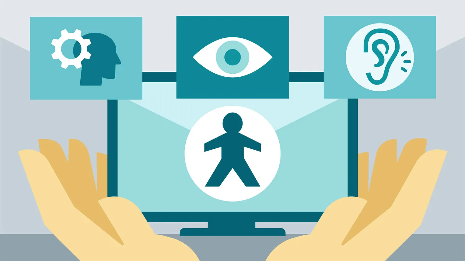
When buttons are not accessible, users with disabilities—such as vision impairments, motor difficulties, or cognitive challenges—may be unable to engage with your site effectively. Inaccessible buttons can block progress, confuse screen readers, and render websites virtually unusable for many people.
What Are Accessible Buttons?
Accessible buttons are those designed to be usable by all individuals, including those who rely on assistive technologies like screen readers, keyboard navigation, or speech recognition software. These buttons are built with semantic HTML, clear labeling, and proper functionality, allowing for seamless interaction regardless of a user’s device or input method.
Why Accessibility Matters
Making buttons accessible is more than just a best practice—it’s often a legal requirement. Compliance with the Web Content Accessibility Guidelines (WCAG) and laws such as the Americans with Disabilities Act (ADA) helps ensure digital inclusion and reduces the risk of lawsuits or penalties.
More importantly, accessible buttons improve the experience for all users. For example, clear labels help users quickly understand what an action will do, and keyboard operability benefits not only those with disabilities but also power users and people navigating without a mouse.
Best Practices for Accessible Buttons
Here are essential guidelines for implementing accessible buttons for websites:
- Use the Correct HTML Elements: Use the
<button>tag or an<input type="button">. Avoid using<div>or<span>for clickable elements, as they do not have built-in accessibility support. - Include Clear, Descriptive Text: Labels should describe the action, such as “Sign Up,” “Download Report,” or “Submit Form.” For icon-only buttons, use
aria-labelto provide context to screen readers. - Support Keyboard Navigation: Ensure buttons are reachable using the Tab key and can be activated using Enter or Space.
- Visible Focus State: When a button is focused, it should display a visible outline or other indicator, making it easy for keyboard users to track navigation.
- Sufficient Color Contrast: Text and background colors on buttons must meet WCAG contrast ratios (at least 4.5:1 for normal text) for legibility.
Example of an Accessible Button
<button type="button" aria-label="Open shopping cart">

  🛒 Cart

</button>
This example provides semantic structure, screen reader support via aria-label, and visual context through an icon and text.
Testing Accessibility
You can test your buttons using tools like:
- WAVE
- axe DevTools
- Google Lighthouse
- NVDA or VoiceOver (screen readers)
These tools help identify accessibility issues such as missing labels, focus problems, and improper HTML structure.
Conclusion
Designing accessible buttons for website functionality is a simple but powerful step toward inclusive web design. By following best practices and using appropriate testing tools, you can ensure that every user—regardless of ability—can engage with your content, complete tasks, and have a positive experience on your site.