In the world of web development, accessibility plays a vital role in creating an inclusive experience for all users, regardless of their abilities. One of the most crucial elements of accessibility is ensuring that interactive components, like buttons, are properly labeled and easy to identify. This is where the button ARIA label comes in. By using the ARIA (Accessible Rich Internet Applications) label for buttons, developers can ensure that their websites are usable by people who rely on assistive technologies, such as screen readers.
What is a Button ARIA Label?
ARIA, which stands for Accessible Rich Internet Applications, is a set of attributes used to enhance the accessibility of web content. The aria-label attribute is one of the most commonly used ARIA attributes. It provides a way to define a label for an element, specifically when a visible label is not present, or when the visual label does not fully explain the purpose of the element.
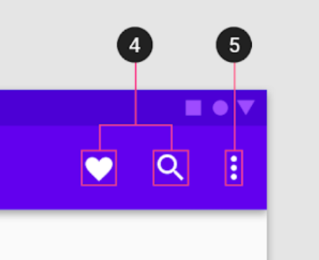
For example, when you use a button with only an icon (like a hamburger menu), a screen reader would normally struggle to describe the function of that button. By adding an aria-label, developers can specify a text alternative that describes the button's function to users who can't see the icon.
Why is a Button ARIA Label Important?
The primary purpose of the button ARIA label is to provide accessibility for users who rely on screen readers or other assistive devices. When you add a descriptive label to a button, it allows screen reader software to read out what the button does, which helps users with visual impairments navigate the website more easily.
Imagine a scenario where a visually impaired user is navigating through a page with buttons that only contain icons. Without an aria-label, the screen reader might simply announce the button as "button," which is not helpful. With the proper aria-label, such as "Open menu" or "Submit form," the user will immediately understand the button’s function, making the experience much more user-friendly.
How to Implement a Button ARIA Label?
Implementing an ARIA label for buttons is a simple yet effective way to improve accessibility. Here's a basic example:
<button aria-label="Close" onclick="closeWindow()">X</button>In this case, the aria-label="Close" describes the function of the button, which is to close the window. Even though the button displays just the letter "X" (often used to signify closing), the ARIA label ensures that a screen reader will announce the button's purpose as "Close."
If you have a button with an icon and no text, the aria-label becomes even more essential:
<button aria-label="Search">

  <img src="search-icon.png" alt="" />

</button>
Here, the button contains only an icon of a magnifying glass, but the aria-label="Search" provides the screen reader with the necessary description of the button’s function.
Best Practices for Using ARIA Labels
While the aria-label attribute is a powerful tool for improving accessibility, there are several best practices to keep in mind to ensure it is used effectively:
- Be Descriptive: The
aria-labelshould clearly describe the action or purpose of the button. Avoid vague labels like "Click" or "Button." Instead, use something more specific, such as "Open menu" or "Submit form." - Don't Use ARIA Labels as a Replacement for Visible Text: While the
aria-labelis important, it should not be used as a substitute for visible text on a button. Where possible, try to provide a visible label in addition to the ARIA label, as this benefits both screen reader users and sighted users. - Use ARIA Labels for Non-Text Buttons: The ARIA label is especially useful for buttons that only contain icons or other non-text content. This way, users who rely on screen readers can still understand the button’s function.
- Avoid Redundancy: If a button already has visible text, avoid adding an
aria-labelwith the same text. This can lead to redundancy and confusion for screen reader users.
Common Mistakes to Avoid
While using the aria-label can significantly improve accessibility, it's important to avoid a few common pitfalls:
- Empty
aria-labelValues: An emptyaria-label=""does not provide any information to screen readers. If a button is purely decorative or non-interactive, consider usingaria-hidden="true"instead to hide it from assistive technologies. - Overuse of ARIA Labels: While the
aria-labelis helpful, using it unnecessarily can clutter the code and potentially confuse screen reader users. It should be used only when necessary, such as when there is no visible text or when the visible text is not descriptive enough.
Conclusion
The button ARIA label is an essential tool for web developers aiming to make their websites accessible to all users, particularly those with visual impairments. By providing clear, descriptive labels for buttons, developers ensure that users who rely on screen readers can easily navigate and interact with web content. When used correctly, ARIA labels can significantly enhance the user experience, creating a more inclusive digital world for everyone. Remember, accessibility isn't just about compliance; it's about making sure every user can access, understand, and enjoy the web.