Color plays a vital role in the world around us. From traffic lights guiding our commutes to charts illustrating complex data, color serves as a powerful communication tool. However, for the estimated 216 million people globally who experience color blindness, navigating a world designed with color in mind can be challenging. In the digital age, where information is increasingly accessed through screens, ensuring color blind accessibility is no longer just a best practice – it's a necessity.
Understanding Color Blindness
Color blindness, also known as color vision deficiency, refers to the inability to distinguish certain colors. The most common form is red-green color blindness, affecting roughly 8% of men and 0.5% of women [WebAIM]. This makes it difficult to differentiate between reds and greens, and sometimes blues as well. Less prevalent forms include blue-yellow color blindness and complete color blindness (achromatopsia).
Challenges in the Digital World
Imagine relying on a color-coded chart to understand financial data, but the red and green bars representing gains and losses appear identical. This is the reality for many color blind individuals when encountering websites, apps, and digital interfaces that rely solely on color coding for conveying information.
Here are some specific challenges color blind users face:
- Distinguishing between elements: Charts, graphs, and maps often rely on color differentiation to highlight key information. Without proper contrast, these elements can become illegible.
- Understanding color-coded instructions: Traffic light icons, error messages, and progress bars frequently use color cues. For someone who can't differentiate red from green, these messages can be confusing.
- Navigating user interfaces: Buttons, links, and form fields may be differentiated solely by color, making it difficult to understand the layout and functionality of an interface.
These challenges not only create frustration but can also lead to exclusion. Color blind users may miss important information, make incorrect decisions, or be unable to complete tasks online.
Creating a More Inclusive Digital Space
Fortunately, there are several ways to design digital experiences that are accessible to everyone, regardless of color vision:
- High Contrast: Ensure adequate contrast between text and background colors. This is the single most impactful step for color blind users. Tools like WebAIM's Contrast Checker [WebAIM Contrast Checker] can help verify sufficient contrast.
- Alternative Text Descriptions: Provide text descriptions for all visual elements, including images, charts, and graphs. This allows screen readers to convey information that may be lost through color alone.
- Meaningful Iconography: Use clear and recognizable icons alongside color coding to reinforce meaning.
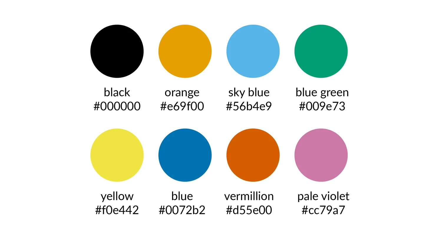
- Color-Blind Safe Palettes: Choose color combinations that are easily distinguishable by people with common forms of color blindness. Resources like ColorBrewer [ColorBrewer] offer colorblind-friendly palettes.
- User Testing: Include color blind individuals in user testing to identify and address accessibility issues early on.
Benefits of Color Blind Accessibility
Designing with color blind accessibility in mind isn't just about inclusivity; it's also good practice. Accessible websites are more user-friendly for everyone, regardless of ability. Additionally, accessible websites rank better in search engine results, potentially reaching a wider audience.
By prioritizing color blind accessibility, we create a more equitable digital experience for everyone. We ensure that information is clear, navigation is intuitive, and everyone has the opportunity to participate in the online world. As technology continues to evolve, embracing inclusivity in design ensures that no one is left behind.