When designing websites, signage, or any public spaces, accessibility is a crucial aspect that can sometimes be overlooked. One key area to consider is color choices. Colors have a significant impact on the user experience, particularly for individuals with visual impairments or color blindness. To ensure your design is compliant with the Americans with Disabilities Act (ADA), it’s essential to understand what colors to avoid for ADA compliance.
ADA compliance aims to create accessible spaces and digital environments for everyone, including people with disabilities. One of the simplest yet most impactful ways to improve accessibility is by selecting appropriate color combinations. Here's a breakdown of which colors to avoid and why, ensuring that your design is accessible and inclusive.
Why Color Choices Matter for ADA Compliance
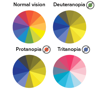
Color choices are critical for people with various visual impairments, such as color blindness or low vision. Approximately 8% of men and 0.5% of women worldwide experience some form of color blindness. The most common types, red-green and blue-yellow color blindness, affect how users perceive colors on a screen or in physical spaces. For those with low vision, poor contrast between text and background colors can make reading and navigation difficult.
By carefully selecting colors that meet ADA standards, you can make your content more readable and your spaces more navigable, ensuring that individuals with disabilities can access the information just as easily as everyone else.
What Colors to Avoid for ADA Compliance
When choosing colors for your design, it’s important to consider contrast and visibility. Here are some color combinations that can hinder accessibility and should be avoided for ADA compliance:
1. Red and Green
For individuals with red-green color blindness, this combination can be particularly problematic. The hues are often indistinguishable to people with this condition, making it difficult for them to differentiate between important information. If these colors are used together for text or buttons, they could make it hard for someone to navigate your website or interpret signage.
2. Blue and Yellow
While blue and yellow may seem like a vibrant, contrasting combination, it poses challenges for individuals with blue-yellow color blindness. This type of color blindness makes it difficult to distinguish between shades of blue and yellow, so using these colors together could create confusion for some users. It’s best to choose a more universally distinguishable combination, such as blue with white or black.
3. Light Text on Light Backgrounds
One of the most common mistakes when it comes to ADA compliance is using light-colored text on a light-colored background. This can make text hard to read, especially for individuals with low vision. A pale yellow text on a white background, for example, would lack enough contrast for many users. To ensure readability, aim for a contrast ratio of at least 4.5:1 between text and background colors, as recommended by WCAG (Web Content Accessibility Guidelines).
4. Dark Text on Dark Backgrounds
Similarly, using dark text on a dark background can create poor visibility. A dark grey text on a black background may be indistinguishable for people with visual impairments. To avoid this, consider using light text on a dark background to create more contrast.
5. Overuse of Bright or Neon Colors
Bright or neon colors, such as bright yellow, neon pink, or lime green, can be overwhelming and hard to read for people with certain visual disabilities, including those with light sensitivity or low vision. These colors can also cause eye strain. Using them sparingly and pairing them with neutral or darker tones will make your design more accessible.
How to Improve Color Accessibility
To ensure your design is ADA-compliant, consider the following tips:
- Use high contrast: Choose colors with sufficient contrast, such as dark text on a light background or light text on a dark background.
- Avoid relying solely on color: Use symbols, icons, or patterns alongside color to convey information. This ensures that users who cannot perceive certain colors can still access the information.
- Test your design: Use color contrast tools and accessibility testing to check that your colors meet ADA standards.
Conclusion
When designing for accessibility, understanding what colors to avoid for ADA compliance is a key step in making your website, signage, or space inclusive. By avoiding problematic color combinations like red-green or blue-yellow and ensuring high contrast between text and background, you can make your design accessible to a wider audience. Remember, accessibility is not just a legal requirement; it’s a way to ensure everyone can interact with your content, regardless of their abilities.