Alfa Romeo has a reputation for impressive designs and unbeatable powertrains. The Italian automaker has been creating sedans, SUVs, and sports cars for over a century while maintaining its unusual logo.
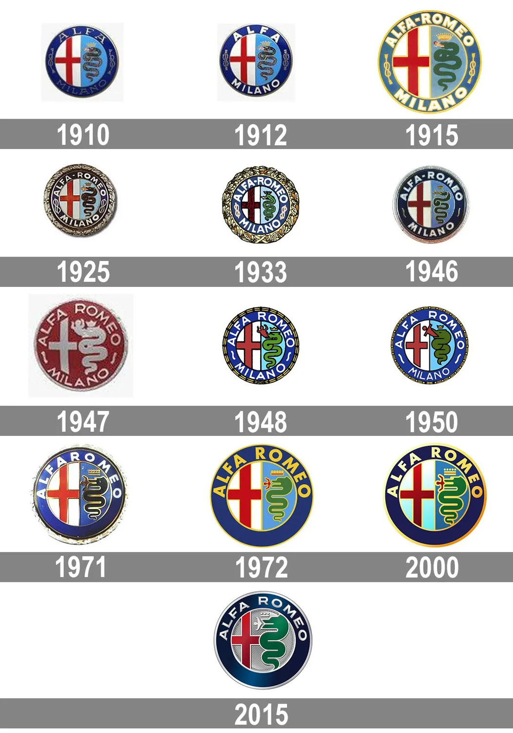
Unlike the simple logos we now associate with car brands, Alfa Romeo has used variations of its coat of arms since 1910. This strange branding choice continues to attract questions and theories about this historic brand. This review covers the evolution of Alfa Romeo’s logo since 1910 and how it compares with modern automobile logos.
Alfa Romeo started as a French Brand?
Alfa Romeo has always operated out of Strada del Portello in Milan, Italy, but it was not always an Italian brand. The company began in 1906 as Società Italiana Automobili Darracq, a French-owned venture in Italy.
The turning point came in 1909 when Italian aristocrat Ugo Stella bought controlling shares in the company. With this influence, Ugo Stella took over the Milan factory and restructured the business into an Italian enterprise.
This transformation became the foundation for the Lombard Automobile Factory, or as the Italians call it, Anonima Lombarda Fabrica Automobili (A.L.F.A.), the name that would later evolve into an iconic auto brand.
Creating the Alfa Romeo Emblem
As part of the decision to restructure the ALFA brand, Ugo Stella hired the illustrator Romano Cattaneo to create a logo that would distinguish the brand. While the bold branding choice is nothing compared to ALFA’s creation of its first two cars in the same year, it is just as impactful.
Romano Cattaneo’s design was simple, if not ingenious. He claimed he got the emblem idea from looking at the Bisconie Visconte on Castello Sforzesco’s Filarete Tower. At that time, the Bisconie Visconte was the coat of arms of the Visconti family, Milan’s ruling family.
Cattaneo created different designs but settled on an emblem that reflects the brand’s connection to Milan. The final design was a round emblem with the flag of Milan, a red cross on a white background, on one half, while the other half had a crowned grass snake, the “Bisconie”, swallowing a man.
How WW1 Influenced Alfa Romeo’s Logo
A.L.F.A. hit hard times between 1910 and 1915, nearly collapsing under the effect of World War I. The company only survived when Naples-born investor, Nicola Romeo, took over the company’s debts from the banks.
Under Nicola Romeo’s leadership, A.L.F.A moved to more war-related manufacturing, adding aircraft engines and ammunition to its production line. By 1918, the company had regained stability and rebranded as Alfa Romeo. The new name, Alfa-Romeo, reflected on the emblem while maintaining the original design element.
Winning the 1925 Grand Prix
Alfa Romeo has maintained its emblem for over a century with minimal adjustments to the design. However, the Italian automaker is known to commemorate events by making subtle additions to the logo.
The first addition was in 1925, when the logo had golden laurels to celebrate Alfa Romeo’s 1925 Grand Prix win. As the inaugural Manufacturer’s World Championship, the 1925 Grand Prix set Alfa Romeo apart as a global automaker.
Between the pre-race publicity and eventual win, the company outshone notable competitors like Bugatti, Sunbeam, Diatto, and Talbot. Alfa Romeo added the golden laurels to its logo to celebrate its new status as the inaugural winner of the international grand prix.
How the Alfa Romeo Logo Evolved Over the Years
The next change to Alfa Romeo’s logo was in 1946, when the company adopted a Spartan-themed emblem to reflect its losses in the Second World War. The war destroyed industrial bases across Italy, including the supplier of Alfa Romeo’s multicolored badges. The company adopted a two-tone badge of red on gold with less notable golden laurels. This dramatic design was short-lived, lasting only 4 years before returning to the 1925 version.
Alfa Romeo maintained its 1925 logo till 1960, when the company added simpler touches to the emblem. The company smoothed the logo outline, removing the scales on the Bisconie and the wavy texture on the blue circle around the emblem. While this change did not come with any difference to Alfa Romeo’s operations, it is likely a reference to the company’s withdrawal from Formula 1 in 1952.
The next change was in 1972 when Alfa Romeo removed “Milano” from the emblem. This change followed Alfa’s expansion beyond Milan. The company had built plants in Naples and test tracks somewhere in Piedmont, making it hard to retain Milan as its base.
Alfa Romeo made another change to its logo in 1982 when it removed the golden laurel from the logo frames and adopted a modern text. This change became the most popular Alfa Romeo logo lasting until 2014.
In 2015, Alfa Romeo made its most recent change to the logo, adopting a more metallic outlook. The logo bears a new font and has lost the bar that has divided the Milan flag and the Bisconie since 1910. This new emblem has a wider snake on a silver background, giving it a more fitting look for Alfa Romeo’s rich car design.
How the Alfa Romeo Logo Compares with Other Automaker Logos
The Alfa Romeo logo stands out among automakers for its historical roots and rich symbolism. The medieval-inspired design reflects Alfa Romeo’s connection to Milan and the company’s growth over time.
In contrast, modern automotive logos use minimalist, geometric design that reflects their engineering efficiency. Ferrari displays its racing legacy with its iconic prancing horse and bold yellow shield. Peugeot uses a lion that conveys its strength and agility. BMW uses a logo similar to Alfa Romeo’s history-rich emblem. The BMW roundel includes blue and white quadrants, showing its Bavarian roots.
Where modern logos trend towards streamlined logos, Alfa Romeo retains a detailed and story-filled emblem. The logo combines tradition and the brand’s commitment to excellent performance.