Light performance maps are visual tools that illustrate how efficiently a diamond handles light. They reveal brightness, contrast, and areas of potential leakage in a way numeric grading alone cannot.
Images clarify precision.
Basic Interpretation
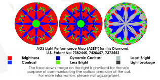
Most light performance maps use color coding to represent light behavior.
Typically:
- Red or bright zones indicate strong light return
- Dark areas represent contrast
- White or pale zones may signal light leakage
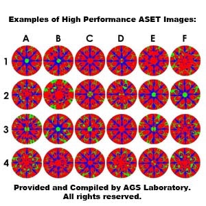
Balanced diamonds show an organized distribution of brightness and contrast rather than scattered irregular patches.
Pattern coherence matters more than uniform brightness.
📷
📷
📷
4
Brilliance Zones
A well-performing diamond displays:
- Evenly distributed bright regions
- Defined symmetrical contrast
- Minimal central leakage
Excessively pale zones beneath the table may indicate shallow pavilion geometry.
Large dark regions may suggest steep angles or symmetry imbalance.
Organized brilliance signals proportion harmony.
Contrast Pattern
Contrast is essential for sparkle rhythm.
Too little contrast:
- Produces flat brightness
- Reduces scintillation
Too much irregular darkness:
- Creates shadowed areas
- Disrupts visual balance
Light performance maps reveal whether bright and dark areas alternate in a disciplined structure.
Precision produces stability.
Comparison Tools
When comparing two diamonds:
- Review light performance images side by side.
- Look for symmetry in brightness distribution.
- Note central consistency under the table.
- Confirm minimal scattered leakage.
Do not rely solely on numeric cut grade. Visual mapping often reveals subtle differences between stones with identical grades.
Evaluation requires context.
Integration With Proportion Data
Light performance maps should be interpreted alongside:
- Crown angle
- Pavilion angle
- Table percentage
- Depth percentage
Maps confirm how those numbers interact in practice.
Data without visualization remains incomplete.
Real-World Relevance
While maps are useful, final evaluation should include:
- Viewing in diffused daylight
- Observing contrast pattern during rotation
- Assessing face-up brightness at arm’s length
Light performance tools guide selection but do not replace direct observation.
Performance must translate to daily wear.
Frequently Asked Questions
Are light performance maps necessary?
They provide valuable visual insight but should complement in-person viewing.
Do all diamonds have maps available?
Not always, depending on vendor and laboratory.
Can two Excellent cut diamonds differ in maps?
Yes, proportion nuances can vary.
Does red always mean better?
Balanced distribution matters more than intensity alone.
Are dark areas bad?
Not necessarily. Some contrast is essential.
Do maps show durability?
No, they reflect optical performance.
Should I prioritize map over clarity?
Optical performance often has greater visual impact.
What is the safest strategy?
Light performance maps are visual tools that illustrate how efficiently a diamond handles light. They reveal brightness, contrast, and areas of potential leakage in a way numeric grading alone cannot.
Images clarify precision.
Basic Interpretation
Most light performance maps use color coding to represent light behavior.
Typically:
- Red or bright zones indicate strong light return
- Dark areas represent contrast
- White or pale zones may signal light leakage
Balanced diamonds show an organized distribution of brightness and contrast rather than scattered irregular patches.
Pattern coherence matters more than uniform brightness.
Brilliance Zones
A well-performing diamond displays:
- Evenly distributed bright regions
- Defined symmetrical contrast
- Minimal central leakage
Excessively pale zones beneath the table may indicate shallow pavilion geometry.
Large dark regions may suggest steep angles or symmetry imbalance.
Organized brilliance signals proportion harmony.
Contrast Pattern
Contrast is essential for sparkle rhythm.
Too little contrast:
- Produces flat brightness
- Reduces scintillation
Too much irregular darkness:
- Creates shadowed areas
- Disrupts visual balance
Light performance maps reveal whether bright and dark areas alternate in a disciplined structure.
Precision produces stability.
Comparison Tools
When comparing two diamonds:
- Review light performance images side by side.
- Look for symmetry in brightness distribution.
- Note central consistency under the table.
- Confirm minimal scattered leakage.
Do not rely solely on numeric cut grade. Visual mapping often reveals subtle differences between stones with identical grades.
Evaluation requires context.
Integration With Proportion Data
Light performance maps should be interpreted alongside:
- Crown angle
- Pavilion angle
- Table percentage
- Depth percentage
Maps confirm how those numbers interact in practice.
Data without visualization remains incomplete.
Real-World Relevance
While maps are useful, final evaluation should include:
- Viewing in diffused daylight
- Observing contrast pattern during rotation
- Assessing face-up brightness at arm’s length
Light performance tools guide selection but do not replace direct observation.
Performance must translate to daily wear.
Frequently Asked Questions
Are light performance maps necessary?
They provide valuable visual insight but should complement in-person viewing.
Do all diamonds have maps available?
Not always, depending on vendor and laboratory.
Can two Excellent cut diamonds differ in maps?
Yes, proportion nuances can vary.
Does red always mean better?
Balanced distribution matters more than intensity alone.
Are dark areas bad?
Not necessarily. Some contrast is essential.
Do maps show durability?
No, they reflect optical performance.
Should I prioritize map over clarity?
Optical performance often has greater visual impact.
What is the safest strategy?
Combine map analysis with proportion data and real-world viewing.